

Multidisciplinary designer
Product Design Lead creating fintech, AI, and emerging tech products—from early ideas through launch and growth.
WORK WITH ME ↗︎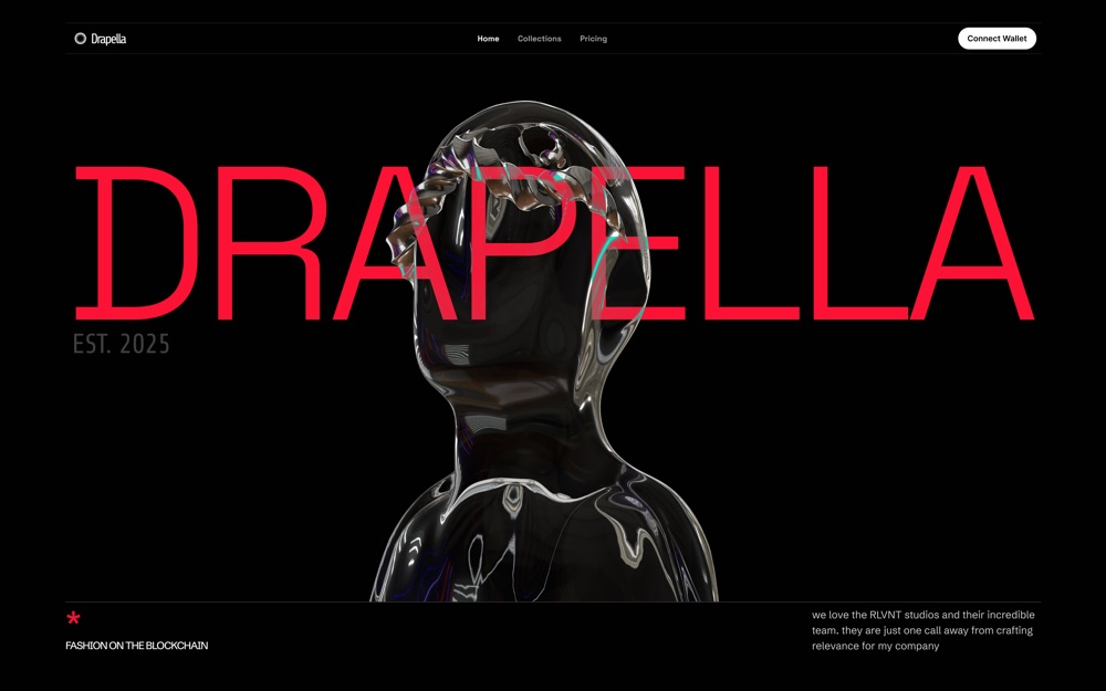
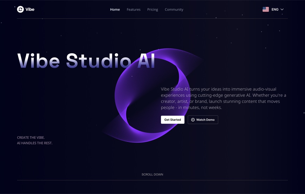
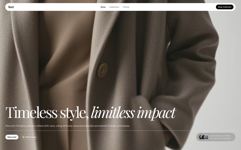
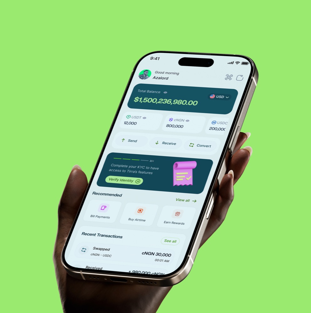


HIGHLIGHTS
[ VIEW MORE WORKS ] Fintech
01 / 06
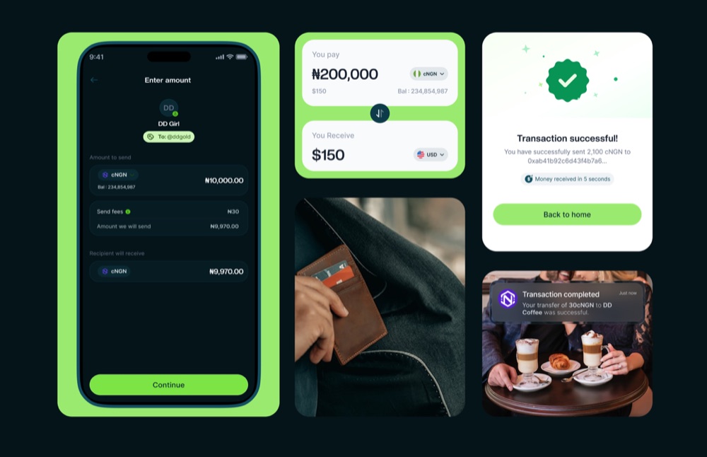
Tirra
600+ waitlist · 1k+ beta transactions
02 / 06
MSQ Design System
40% faster design-to-development handoff
03 / 06
MUST Fintech
Leading 2 Web3 products and a shared token ecosystem
 Brand & Web
04 / 06
Wowzi Brand System
One brand system across 3 products
 HR · Wellness
05 / 06
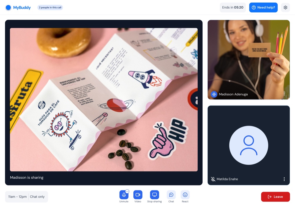
Buddily
Ethical virtual coworking across 3 user experiences
 SaaS
SaaS06 / 06
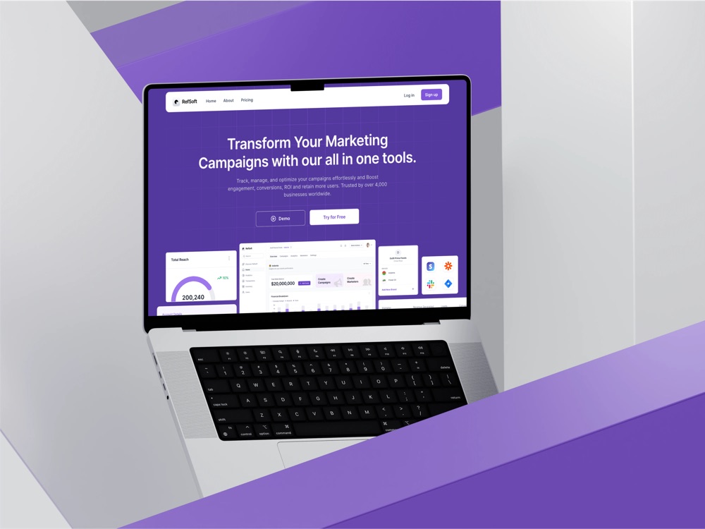
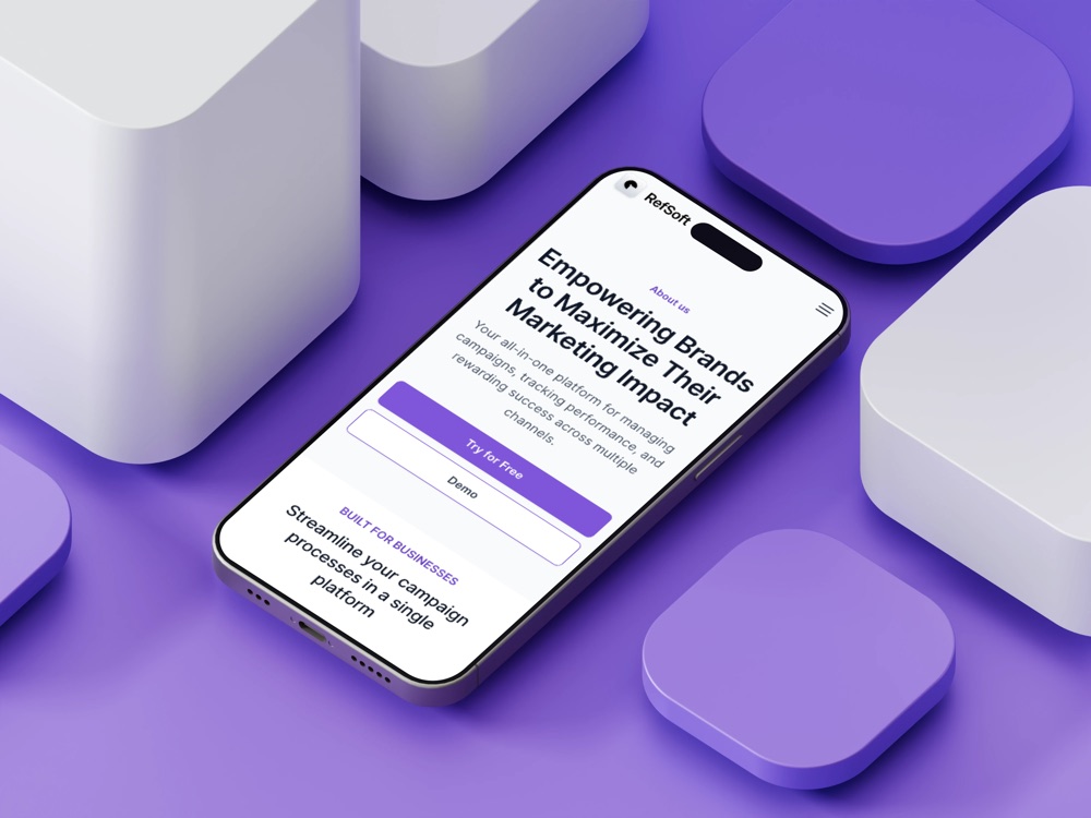
Refsoft
Marketing operations across campaigns and ROI


Hi, I'm Matilda Anashie. I design digital products, explore emerging tech, and care deeply about building things that genuinely help people.

Slice of me
'/%3e%3cg%20id='Happy'%20clip-path='url(%23clip0_0_4)'%3e%3cpath%20id='Vector'%20d='M34.1555%2033.4463C32.4515%2034.8202%2030.3286%2035.5694%2028.1398%2035.5694C25.951%2035.5694%2023.8281%2034.8202%2022.1241%2033.4463C21.6035%2033.0137%2020.9324%2032.8055%2020.2584%2032.8676C19.5844%2032.9298%2018.9626%2033.2571%2018.53%2033.7777C18.0973%2034.2982%2017.8892%2034.9694%2017.9513%2035.6434C18.0134%2036.3174%2018.3408%2036.9391%2018.8614%2037.3718C21.4648%2039.5451%2024.7485%2040.7356%2028.1398%2040.7356C31.5311%2040.7356%2034.8148%2039.5451%2037.4182%2037.3718C37.9388%2036.9391%2038.2661%2036.3174%2038.3283%2035.6434C38.3904%2034.9694%2038.1823%2034.2982%2037.7496%2033.7777C37.5354%2033.5199%2037.2725%2033.3069%2036.9759%2033.1508C36.6793%2032.9946%2036.3549%2032.8984%2036.0212%2032.8676C35.3471%2032.8055%2034.676%2033.0137%2034.1555%2033.4463ZM20.4927%2025.213C20.9969%2025.213%2021.4897%2025.0635%2021.9089%2024.7834C22.3281%2024.5033%2022.6548%2024.1052%2022.8477%2023.6394C23.0406%2023.1737%2023.0911%2022.6611%2022.9928%2022.1667C22.8944%2021.6722%2022.6516%2021.218%2022.2952%2020.8615C21.9387%2020.5051%2021.4845%2020.2623%2020.99%2020.1639C20.4956%2020.0656%2019.983%2020.1161%2019.5173%2020.309C19.0515%2020.5019%2018.6534%2020.8286%2018.3733%2021.2478C18.0932%2021.667%2017.9437%2022.1598%2017.9437%2022.664C17.9437%2023.34%2018.2123%2023.9884%2018.6903%2024.4664C19.1683%2024.9444%2019.8167%2025.213%2020.4927%2025.213ZM35.7868%2020.115C35.2827%2020.115%2034.7899%2020.2644%2034.3707%2020.5445C33.9515%2020.8246%2033.6248%2021.2227%2033.4319%2021.6885C33.2389%2022.1543%2033.1884%2022.6668%2033.2868%2023.1613C33.3852%2023.6557%2033.6279%2024.1099%2033.9844%2024.4664C34.3409%2024.8229%2034.7951%2025.0657%2035.2896%2025.164C35.784%2025.2624%2036.2965%2025.2119%2036.7623%2025.019C37.2281%2024.826%2037.6262%2024.4993%2037.9063%2024.0801C38.1864%2023.6609%2038.3359%2023.1681%2038.3359%2022.664C38.3359%2021.9879%2038.0673%2021.3396%2037.5893%2020.8615C37.1112%2020.3835%2036.4629%2020.115%2035.7868%2020.115ZM28.1398%202.27181C23.0983%202.27181%2018.17%203.76679%2013.9782%206.56769C9.78635%209.36859%206.51921%2013.3496%204.58991%2018.0073C2.66062%2022.6651%202.15583%2027.7903%203.13938%2032.7349C4.12292%2037.6795%206.55063%2042.2214%2010.1155%2045.7863C13.6804%2049.3512%2018.2223%2051.7789%2023.1669%2052.7624C28.1115%2053.746%2033.2367%2053.2412%2037.8945%2051.3119C42.5522%2049.3826%2046.5332%2046.1154%2049.3341%2041.9236C52.135%2037.7318%2053.63%2032.8035%2053.63%2027.762C53.63%2024.4146%2052.9707%2021.0999%2051.6897%2018.0073C50.4087%2014.9147%2048.5311%2012.1047%2046.1641%209.73772C43.7971%207.37074%2040.9871%205.49314%2037.8945%204.21214C34.8018%202.93114%2031.4872%202.27181%2028.1398%202.27181ZM28.1398%2048.1542C24.1066%2048.1542%2020.164%2046.9582%2016.8105%2044.7175C13.457%2042.4767%2010.8433%2039.2919%209.29989%2035.5657C7.75646%2031.8396%207.35262%2027.7394%208.13946%2023.7837C8.92629%2019.828%2010.8685%2016.1945%2013.7204%2013.3426C16.5722%2010.4907%2020.2058%208.54852%2024.1615%207.76168C28.1172%206.97485%2032.2173%207.37868%2035.9435%208.92211C39.6697%2010.4655%2042.8545%2013.0793%2045.0952%2016.4327C47.336%2019.7862%2048.5319%2023.7288%2048.5319%2027.762C48.5319%2033.1703%2046.3835%2038.3572%2042.5592%2042.1814C38.7349%2046.0057%2033.5481%2048.1542%2028.1398%2048.1542Z'%20fill='var(--fill-0,%20%23303030)'/%3e%3c/g%3e%3c/g%3e%3cdefs%3e%3cclipPath%20id='clip0_0_4'%3e%3crect%20width='52'%20height='52'%20fill='white'%20transform='translate(2.14015%201.76302)'/%3e%3c/clipPath%3e%3c/defs%3e%3c/svg%3e)
Open to product design leadership opportunities and collaborations across fintech, AI, and emerging technology.
Let’s Talk.
Selected work
Hiring or building? Let’s talk
 Web Design
01 / 09
Folde Studio
A scalable sales and publishing system
Fintech02 / 09
Tirra
600+ waitlist · 1k+ beta transactions
03 / 09
Wowzi
Creator marketplace across user types
04 / 09
MUST Fintech
Leading 2 Web3 products and a shared token ecosystem
05 / 09
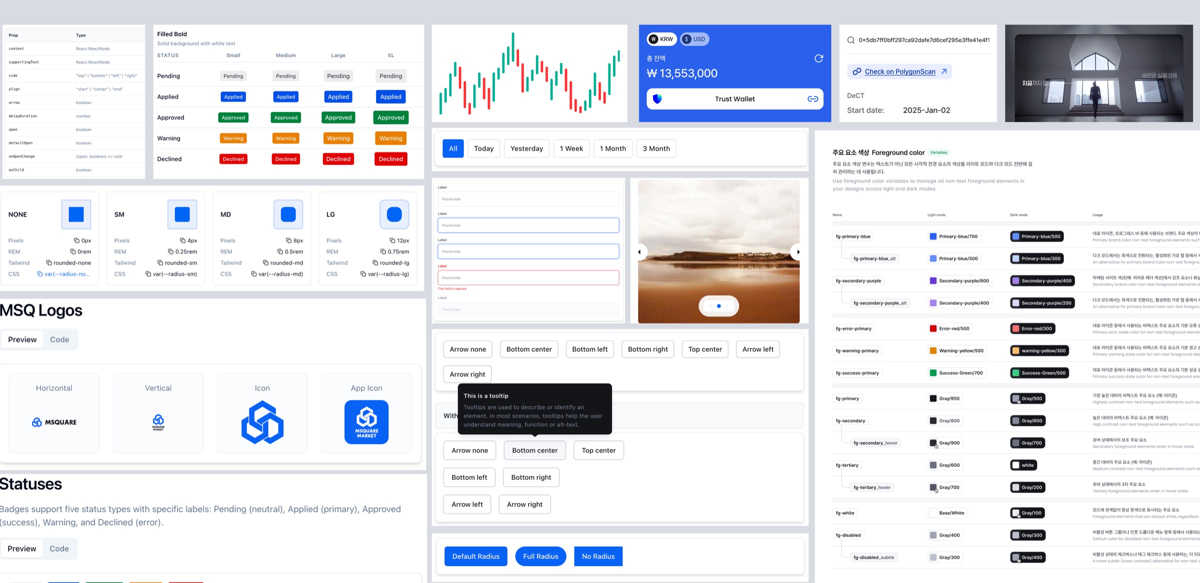
MSQ Design System
40% faster design-to-development handoff
Brand & Web06 / 09
Wowzi Brand System
One brand system across 3 products
HR · Wellness07 / 09
Buddily
Ethical virtual coworking across 3 user experiences
SaaS08 / 09
Refsoft
Marketing operations across campaigns and ROI
 E-commerce
09 / 09
TAJRR
Two-sided commerce across web and mobile
Open to product design leadership opportunities and collaborations across fintech, AI, and emerging technology.
Let’s Talk.
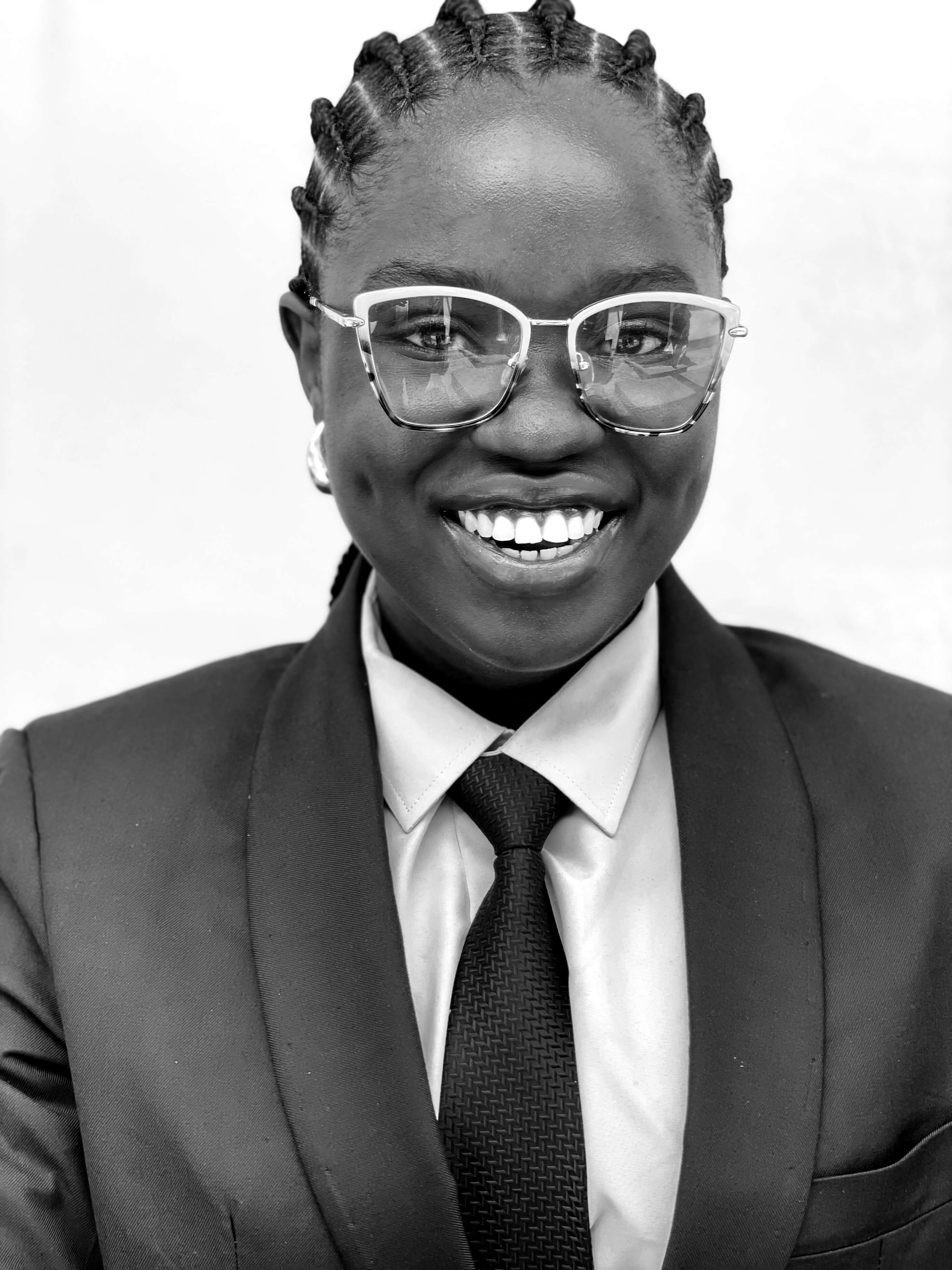
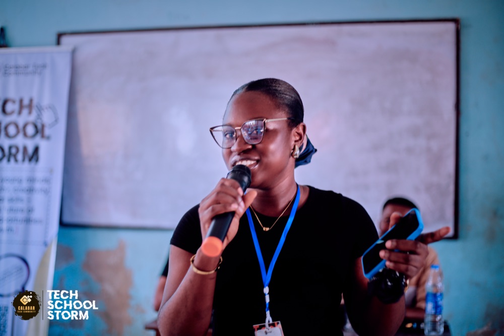
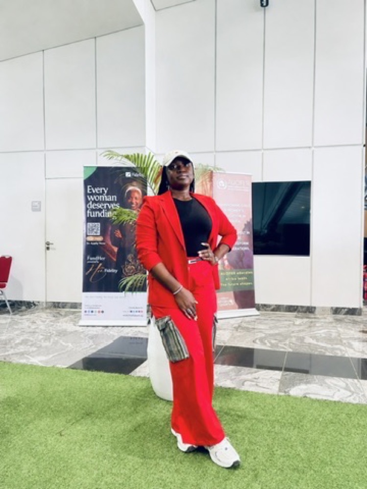
Hi, I'm Matilda Ipeh Anashie
I'm a Nigerian Product Design Lead with 6+ years of experience designing AI, fintech, creator economy, SaaS, and Web3 products across Africa, Asia, and Europe.
My background in Electrical and Electronics Engineering and Telecommunications Engineering shapes how I work: understanding complex systems, finding the human problem within them, and building clear, trustworthy products. I currently lead product design for MUST Company’s Blockchain and User Experience Innovation Design team, guiding a four-designer team across two Web3 products, their websites, and a shared token ecosystem. I also introduced design-system and AI-assisted workflows that improved design-to-development handoff by 40%.
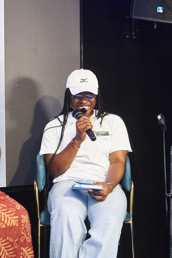
Beyond product work, I co-founded Canann Impact Foundation, contribute to open-source technology through Outreachy and ODK-X, and support the design community through mentorship, writing, and speaking.
My essays, notes, experiments, and opinions.
- read a new chapter

 fill journal pages
- disappear into a playlist

 draw or just doodle
- notice type everywhere

something happened today and I realised —
"Everything we need to be happy in life is right in front of us and yet we look for it in all the wrong places."
Living life in colours 🌻🦋

I love watching movies, but my latest obsession is K-drama. The stories and the acting keep me absolutely glued to my screen. A perfect weekend unwinding mood.
Open to product design leadership opportunities and collaborations across fintech, AI, and emerging technology.
Let’s Talk.

Bits of my life
Rebuilding a design system two Web3 products could share — and teams would actually use.
I led the system from rejected Figma proposal to a coded and hosted source of truth, reducing design-to-development handoff time by 40% and helping earn my promotion to Product Design Lead.
Led the rebuild of the shared system behind MSQ and SUT, turning a rejected first proposal into a coded reference that reduced handoff time by 40%.
Two products. Separate patterns. One shared wallet ecosystem.
MSQ and SUT were evolving as separate Web3 products even though users could trade the same KWT token through both. The design infrastructure had not kept pace: buttons used different radii, typography drifted between surfaces, and colour changes required manually updating components.
In financial services, visual inconsistency isn’t just an aesthetic problem. It erodes exactly the kind of trust users need to feel when making decisions about their money.
As the design-systems lead, I had to create a standard four designers could share, seven engineers could implement, and four other stakeholders could understand without slowing ongoing product delivery.
The first proposal worked in Figma but failed the adoption test.
I presented v1 as a Figma-based system, but other product departments rejected it. That response changed the brief: the next version could not simply document design decisions. It had to fit the way teams already designed, reviewed and built products.
The proposal defined what teams should use, but not how those decisions would travel from design through review and engineering implementation.
Colours were hardcoded values. A brand update meant manually locating and changing components across the product codebases.
v1.0 covered every edge case I could imagine. Too complex to onboard quickly. Complexity without adoption is just overhead.
Other departments were being asked to accept a finished answer instead of participating in a system they would need to use and extend.
“A system nobody uses isn’t a system. It’s a Figma file with good intentions.”
Smaller. Sharper. Token-first from day one.
I rebuilt v1.0 from the foundation: tokens before components, followed by shared patterns, documentation and a coded reference engineers could use directly.
The principle behind v2.0: build for adoption, not comprehensiveness. A smaller system used consistently creates more value than a large library teams work around.
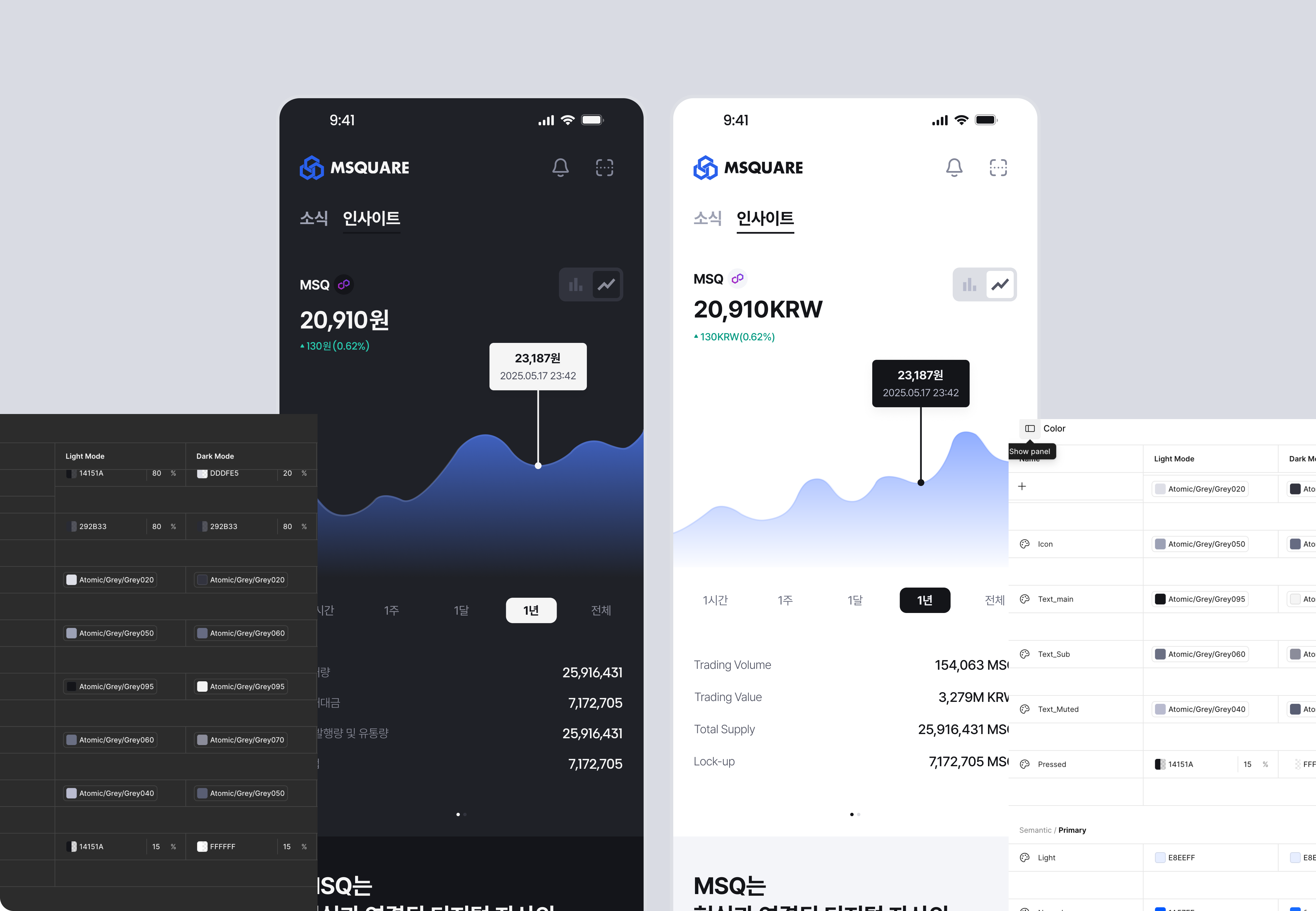
Three-layer token system. Brand →︎ Mapped →︎ Alias.
Tokens are named for their role, not their value. primary-color not #2563EB. One token update propagates everywhere simultaneously.
The Mapped collection defines the full primitive scale (blue-50 through blue-950, gray, red). The Brand collection references mapped primitives with semantic names. Alias tokens bind component-level decisions to brand tokens.
The live workflow records the exact Figma variables, aliases and intended use before translating them into documentation and implementation guidance. Missing evidence is flagged instead of replaced with a generic assumption.
Three font systems. One for each context.
MSQ serves English and Korean markets across mobile and admin surfaces. Each context needed its own optimised type system.
H1 40px · Body 16px
Weights: 400 500 600 700
Optimised for Latin script on mobile. Tight negative letter-spacing at display sizes.
Display 56px · Body 16px
Weights: 400 500 600 700
CJK-optimised. Separate token scale for Korean line heights and letter spacing.
H1 32px · Body 16px
Weights: 400 500 600 700
Data-dense admin interface. Positive letter-spacing at body size for screen legibility.
The See-Do Process: every screen shows what you can do next.
The guiding principle behind every MSQ component: a user should never look at a screen and wonder what they can do. Available actions need to be visible, not discoverable. This shaped button hierarchy, empty states, and notification patterns throughout the system.
Primary CTAs are unambiguous. Secondary actions are subordinate. The hierarchy communicates priority before copy is read.
primary secondary outline ghost — each role distinct, each level subordinate to the one above it.
A repeatable way to carry design-system intent into AI-assisted work.
I created the AI-Native Design playbook so the team could connect an existing Figma system to AI-assisted product work without asking the model to guess. The workflow moves through evidence gathering, translation, building and validation.
View AI-Native Design playbook ↗︎Capture exact foundations, typography, components, states and constraints from Figma before generating anything.
Turn approved system evidence into the smallest useful artifact: project rules, token guidance, component documentation or a reusable prompt.
Use that reviewed context when generating web or mobile designs for legacy products, then compare the result with the source system before it moves forward.
A system teams could extend without breaking.
Designers now share the relevant components, tokens and documentation alongside each design. Engineers receive the implementation reference with the interface, while new additions are reviewed against an explicit use case and “When Not To Use” guidance before they enter the shared library.
Each component includes anti-pattern guidance so designers and engineers can understand its intended role before applying it.
Designers share the relevant variables, components and documentation with each design so engineers can trace implementation decisions back to the system.
The rejection of v1 was the most useful signal in the project. It taught me that adoption is the product: a design system is not successful because the library is complete, but because designers, engineers and stakeholders can use it to make decisions together.
Leading that shift — from Figma proposal to shared design-and-code infrastructure — helped earn my promotion to Product Design Lead.
The next phase is now documented in the open-source AI-Native Design playbook: a repeatable workflow the team can set up and adapt when generating AI-assisted web and mobile designs for legacy products, while preserving the evidence and governance of the original system.